
In my last post I highlighted the importance of ARIS PPM for MashZone. Today, let me put this into practice.
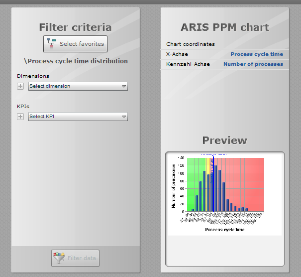
Once you have setup ARIS PPM to show an analytic result you may want to publish this in a dashboard. As of MashZone 2.2 and ARIS PPM 5.1 this consists of only two steps.
First, in ARIS PPM, copy the favorite’s address to your clipboard using a context menu as depicted below.
![]()
Second, having the favorite’s URL in your clipboard, go to MashZone Composer to edit a MashApp and choose the all new ARIS PPM chart component.
![]()
This new visualization component will reuse the reference to the ARIS PPM favorite which currently resides in the clipboard. Once you edit the component's data assignment paste the favorite’s URL.
.png)
In contrast to MashZone charts you already know, the new ARIS PPM component does not need a data feed. Instead it refers to ARIS PPM favorites directly.
This enables you to reuse definitions of the data visualized, possibilities for interactive filters, thresholds, axis scaling and value ranges and much more as it has been defined in ARIS PPM already.
So the data assignment of the ARIS PPM component looks slightly different if compared to other MashZone charts.
Although this chart is driven by ARIS PPM it remains still fully interactive with other MashZone charts. So you can sent user interaction events to it to define interactive filters or - the other way round - subscribe to values which have been selected in the ARIS PPM chart.
Finally the published ARIS PPM chart looks like this:

In addition the ARIS PPM data source remains so your existing MashApps still work as before. In fact, the data source has been improved a lot, too. This will be summarized in the third article on ARIS PPM integration.

.jpg)


dario borsotti on
Hi, Stephan,
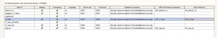
I patched PPM tio 5.1 and upgrade mashzone to 2.2 (professional edition).
In PPM I saw the option "Use in aris Mashzone" on my favorite propierties.
But When i create a new mashapp the new component is not displayed, as you can see in the attachment image.
There are some limitation?
thanks