
With the new ARIS 10 SR18 we provide new business-friendly chart types for both structural and operational data. The new polar charts (spider chart) enable the comparison of multiple dimensions and multiple KPIs. New heat maps allow to depict data values for an asset of interest across two axis variables as a grid of colored squares.
Please watch a short video about the new features here.

New polar charts with multiple dimensions and multiple KPIs.
In case you have only two dimensions resulting in a straight line you can switch to a curved mode, or you can apply ‘Spiderweb’. You can also change the chart type, switch off data points, or switch between stacked or overlaid views. You can visualize KPIs as columns and stack them.
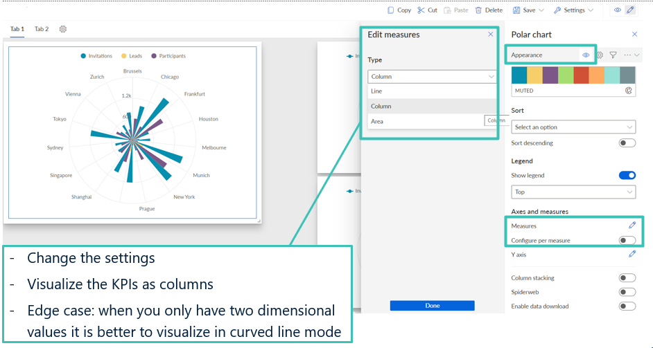
Change settings in polar charts

Various views of polar charts
The new heat maps help you to compare KPIs on two dimensions and map them to certain colors. You can adapt the appearance to your needs and define data ranges. You can select different color palettes and also change the colors via value settings.

Heat map settings
The new charts and heat maps offer you many possibilities for individual settings that help you to better structure and visualize your business data. Share your KPIs with your peers and take better decisions faster. This can help you to save time and money.


Veronika Ellermann on
Hi Elke,
That looks really nice :) By any chance: do you also have a guide for how to get started creating those new diagram types?
Best,
Veronika