Hey everybody,
I have built an APG Workflow to enable our users to edit model attributes on both of our databases at once (development and publishing database in our case). What basically happens is when the workflow is started the user sees this dialogue:
And they get to edit the attribute values to their liking. Attributes that cannot be empty are capitalised on the left. The workflow then checks whether the required attributes are all not empty and if it all looks good the workflow writes the attributes to the model on the dev and pub databases.
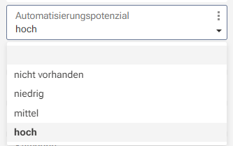
This is working fine so far, but there is a usability issue with value attributes (in german ARIS they are called "Wert" so I just naively translate it to value, hope that is correct...) where you need to pick a pre-defined value instead of just typing your own. One example of this is our attribute "Automatisierungspotenzial" which has these pre-defined values:
For this attribute the users need to enter the text 100% correctly for the value to be written to the attribute of the model. This is a rather simple example where its not too bad, but we have ones with more and more complicated options, so typos or not remembering all the options are an issue for us.
Do you guys have an idea how I can build the dialog in a way that improves usability of value attributes? Ideally it would show the values to select from, but just some kind of way to show the possible values would be helpful already.
I chose to use a table for the dialog to be able to accomodate different attributes for different model types. The report script checks what attributes are available for the selected model type and fills the table accordingly. I imagine if I chose seperate fields instead of a table I would get more freedom, but I would lose the flexibility of my table solution, wouldn't I?
I imagine I'd have to hard code each attribute to its field which wouldn't be as easy to keep up to date. Is there a solution to make a dialog offer more text boxes or whatever depending on how many are needed for the model at hand?
I'm looking forward to the discussion!
Cheers,
Bennet


Veronika Ellermann on
Hi Bennet,
why don't you "pre-display" the options that the user has? Each object has its own GUID. So, in your case "hoch" has a GUID and you could call the drop list (just copied from one of our scripts): iDialogTemplate.DropListBox(185, 289 +lY, 320, 70, [getString("TEXT_25"), getString("TEXT_26")]
Maybe this helps :)
Best,
Veronika