Enterprise Architecture Management comprises many tasks which require careful analysis in order to be carried out successfully. Dashboards as provided by ARIS Aware can present the results of such analyses in a visual way and make you aware (no pun intended) of current or upcoming issues and opportunities. This allows you to take the right decisions in order to handle them successfully.
In that sense, the EAM dashboards provided out of the box by ARIS Aware address topics like application lifecycle management and standardization, portfolio management, application consolidation or cost management. Dashboards for these use cases are provided for organizational units and applications in ARIS Connect. A third one, which is concerned with strategy management, is available for strategy and objective diagrams. It can also be used to track IT-related objectives. These dashboards are described in detail below.
Dashboard for organizational units
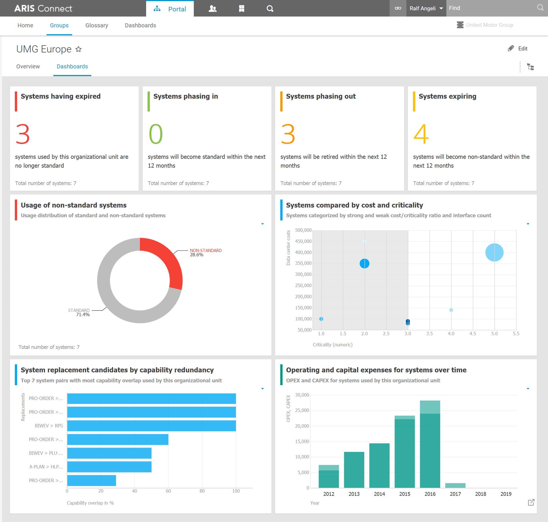
The EA dashboard for organizational units contains information about all applications (aka IT systems) that are used by or are under the responsibility of an organizational unit. It covers most of the topics mentioned above.
The panels in the first row are concerned with the application lifecycle and show the number of applications which just became non-standard, will soon become standard, will soon retire or will soon become non-standard. This allows you to identify changes in the application landscape that need to be reacted upon, e.g. by switching IT systems or starting migration projects.
Based on the same data as the panels in the first row is the pie chart that shows the usage of standard versus non-standard applications. Using a lot of non-standard systems is usually not a good idea because those could e.g. be unsupported, out of warranty or costly to keep around. If the chart shows a high percentage of those systems, you may want to look for reasons that justify keeping them situation or opportunities to get rid of them.
The bubble chart in the second row shows all applications of the organizational unit according to their cost, criticality and interface count. It can be help to decide if certain IT systems should be kept and nurtured or phased out. For example systems with high cost, low criticality and a low number of interfaces to other systems are candidates for removal. They are expensive, not essential for operating the business and their absence would not affect many other systems.
The removal of an application might require a replacement for it. Ideally this would be an application which is already used in the organization and which has the same or similar capabilities. Such information is provided by the left chart in the last row. It shows the top seven system pairs which have the largest capability overlap. If there is a pair with an overlap of 100 percent, the system on the left side of the pair can (in theory) fully replace the one on the right. Of course, there are also other aspects to be checked, but the chart can help consolidating the application landscape for the organizational unit nevertheless.
The last chart is the odd one out. It is the only chart in the dashboard that uses data originating mainly from an external system. All the other charts are based on data which is stored in ARIS. But the last one provides cost information coming from Alfabet. This is possible by using the ARIS Alfabet Interoperability and linking ARIS objects to objects in Alfabet. The ARIS report preparing the data for the chart can then fetch the operating and capital expenses for linked organizational units directly from Alfabet. A similar setup could also be done for other external data sources. It allows you to get additional data into the picture that is not stored in ARIS. In the example this is the development of IT cost for the organizational unit over time. This can help you identify e.g. increasing operational costs that have to be countered by more aggressive system consolidation or other means.
Dashboard for applications
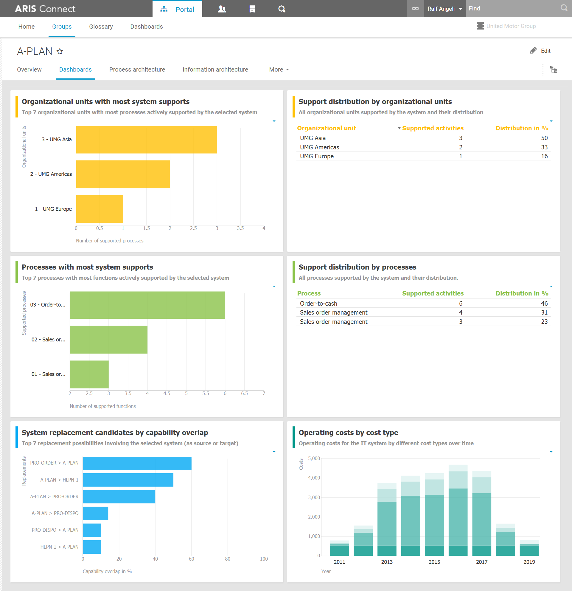
The EA dashboard for applications provides you with an overview of where and by whom the selected IT system is used. This is what the charts in the first two rows show. The charts in the first row show which organizational units use the IT system. This is determined by evaluating the process support maps maintained in ARIS. The charts in the second row show the usage of the IT system within business processes. Those are based on the direct connection between functions and applications modeled in EPCs. The charts give you an insight into how tightly connected an application is in the organization and which processes or organizational units are affected, should anything be changed regarding the application or should it suffer a breakdown.
The charts in the second row are similar to those in the last row of the dashboard for organizational units. The left one shows the top seven replacement candidates for the selected application based on the capabilities they provide. It can be used for system consolidation. The right one shows different types of cost for the selected application over time. The data for this chart also comes from Alfabet and is usable for objects that are linked with Alfabet. The information makes it possible to detect and react upon unwanted cost increases for the system.
Dashboard for objectives
The dashboard for objectives is not strictly an EA dashboard because it can be used for business and IT objectives alike. It is displayed as a panel besides strategy or objective diagrams in ARIS Connect. Those diagrams contain information about the vision and mission of a company, as well as objectives and strategies that are derived from them. The accomplishment of the objectives can be measured with KPIs that are also maintained in ARIS.
The dashboard presents this information in a visual way that allows you to evaluate the goal accomplishment without much cognitive effort. It contains a list of objectives and for each objective a list of assigned KPIs. For each objective and for each KPI a traffic light is displayed which indicates the state with a red, yellow or green color. The color is determined according to predefined thresholds for each KPI and a weighted average of all assigned KPIs for the objectives. This is similar to what is calculated by the Balanced Scorecard reports in ARIS. So, with a quick look at this dashboard you can easily see which objectives might need more attention.
This was a quick look at the EA dashboards provided out of the box by ARIS Aware. Hopefully you liked it. Let me know in the comments in case you have any questions. And make sure to catch the other articles in the series on ARIS Aware. For that you can check the overview blog post or subscribe to the ARIS Aware tag.


