
The recently released ARIS version 10.0 SR18 includes a new ARIS Aware dashboard for application portfolio management. You can see it in the following screenshot.
With this series of blog posts, I’d like to show you how this dashboard was conceived and implemented. Even if you are not too much into application portfolio management, the description should give you an idea about what you’d have to do if you want to create a dashboard for your own itch that needs to be scratched. And obviously I want to make a bit of advertising for this thing which might otherwise be overlooked. In a later blog post I’ll describe why this dashboard in particular is a bit elusive. So, let’s get to it…
Before SR18 ARIS already offered two dashboards that deal with application standardization, rationalization, and consolidation. Those can be accessed via the ARIS Connect fact sheets of organizational units and applications and show (other) applications related to the respective artifacts. What was missing was a dashboard for arbitrary sets or groups of applications. A flexible way to create such groups is to use diagrams as containers for applications. In ARIS the typical diagram type used for this is the Application System Type Diagram. So, the plan was to create a dashboard that would be offered via the fact sheet of this diagram type.
Now the question arose, which business questions the dashboard should answer or which type of decisions it should support. The goal was to offer insights related to typical investment decisions for (a portfolio of) applications – which to evolve, which to retire, which to replace, or which to consolidate. Measures and KPIs that are traditionally used for this are business value, technical fit, cost, or associated risk. A comparison of application capabilities can help with the consolidation question and information about the applications’ life cycle states makes it obvious which can be kept for longer and which will be phased out soon. You can look at a lot more factors, but for our dashboard we left it at that.
The next task was to define charts that offer these various pieces of information in a sensible and meaningful way.
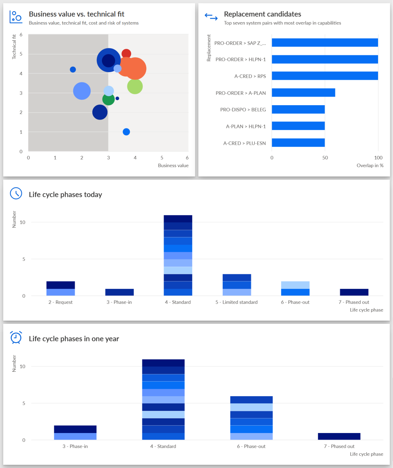
You might have guessed or known already what was done with the measures and KPIs mentioned above. For these there is a classical representation in the form of a four-quadrant portfolio diagram. Business value and technical fit form the axes of the diagram with each dimension being divided into a low and a high part. This results in the four quadrants with each quadrant suggesting a different investment (or divestment) strategy. The cost and risk KPIs can be included as well. Applications are shown as bubbles where the size represents cost and the color the associated risk.
For the comparison of application capabilities, a bar chart with pairs of applications was chosen. Each bar shows the overlap of capabilities between the two applications as a percentage.
For the life cycle information, we decided to use two histograms with applications in their respective life cycle phases. The first shows the current situation and the second one the situation in one year. Like this you can look up how a single application will progress in its lifecycle, but it also how the application portfolio develops as a whole.
You can find these four charts in the screenshot above.
Here is an example of how the information in the dashboard can be used: The portfolio diagram might make you aware of one or more applications that have a low business value and a poor technical fit. Those would be good candidates for getting rid of, especially if they also cause high cost and have high associated risk which you can also check in the portfolio view. In such cases it might be interesting to know, if new applications need to be acquired or if there are existing applications that have capabilities similar to those of the ejection candidates. This you can check in the capability comparison chart. And in case you found replacement candidates, you can see in the life cycle charts if they could actually be used for a reasonable amount of time or if they are on their last legs.
So much for the introduction and a look at the business side of the dashboard. In the next blog post we’ll look at the first phase of the implementation. In particular, how the data for the dashboard was extracted from the ARIS repository. See you there!