

Welcome back to the blog post series about the implementation of the new dashboard for application portfolio management in ARIS. The topic of the last article was the preparation of the raw data which is used by the dashboard. In this article we are looking at the creation of the data feeds which combine and filter this raw data to make it consumable by the charts in the dashboard.
There are four charts in the dashboard. For each of them a separate data feed was implemented. Like in the last article we will be focusing on the chart with the application portfolio. The data feeds for the other charts work analogously, at least with respect to the context filtering, so we can save ourselves the repetition.
Here is the chart again for reference:
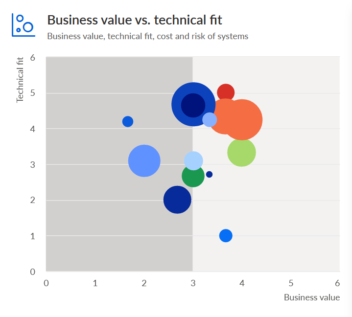
The chart shows technical fit, business value, cost, and risk for the applications of an application system type diagram. In the last article we looked at two reports that provide most of the necessary information to realize this: EA - Systems with data and EA - Models and systems. The former generates a table with the KPIs for all applications and the latter a table that lets us determine which applications are part of a certain diagram.
The new data feed would combine these two data sources and use the diagram/application associations to filter out the applications not in the diagram. In addition it would insert a column with color codes for indicating the risk of applications.
The creation of color codes was necessary because the EA - Systems with data report only generates a numeric value for the risk score. I didn’t want it to generate color codes itself because the change of colors is quite common (e.g. to adapt them to a corporate identity) and should therefore be easy. With the codes in the data feed, there is no need to install an unlocked version of the report and no requirement for programming skills.
The new data feed was called EA - ASTD - Systems with data. I’ll show you how the whole thing looks like in ARIS’ relatively new React-based feed editor and then explain how it was built. (Please note that I’ve rearranged its contents a bit for this article. It will look slightly different, should you open it in your ARIS installation.)
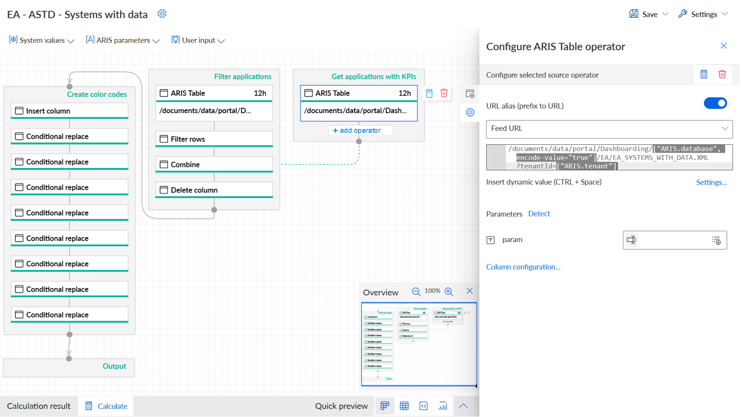
We started by making available the data produced by the two reports I described in the last blog post. This was done with two ARIS Table operators that reference the respective output files. In the screenshot above, the operator for the output of the EA - Systems with data report is selected. You can see that it contains a path to the output file:
/documents/data/portal/Dashboarding/["ARIS.database", encode-value="true"]/EA/EA_SYSTEMS_WITH_DATA.XML?tenantId=["ARIS.tenant"]
[ARIS.database", encode-value="true"] and ["ARIS.tenant"] are placeholders which will be replaced by the name of the active ARIS database and tenant when the dashboard is opened in the ARIS Connect portal. These placeholders make it possible to use the dashboard on different tenants and with different databases without having to create a variant for each.
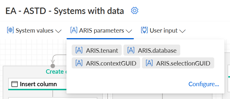
Up until SR17 you had to do a lot of additional tasks in order to make use of such placeholders. You had to create text input fields, connect them with URL parameters, hide them from view, etc. This was quite cumbersome. From SR18 onwards you can configure and use them directly which is quite a relief. Configuration, i.e. specifying default or preview values, is done by opening the ARIS parameters drop-down and clicking on Configure:
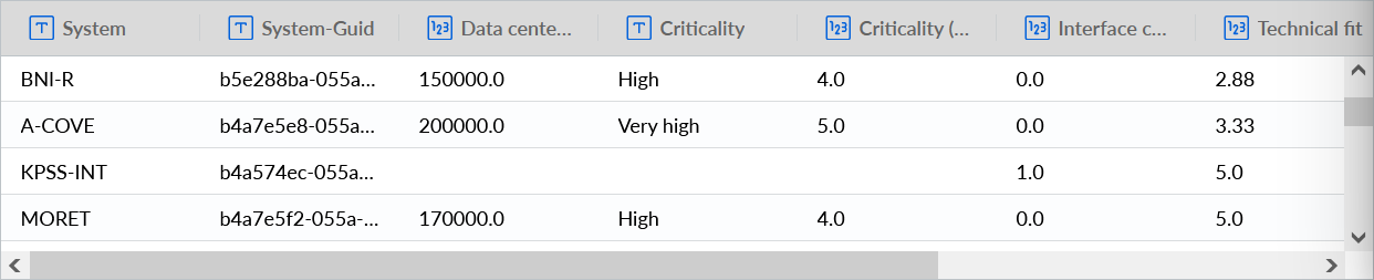
Anyway, back to the data that is delivered by the configured ARIS Table operators. The one which references the file EA_SYSTEMS_WITH_DATA.XML produces the following output:
The other, which loads the file EA_MODELS_AND_SYSTEMS.XML, delivers this:
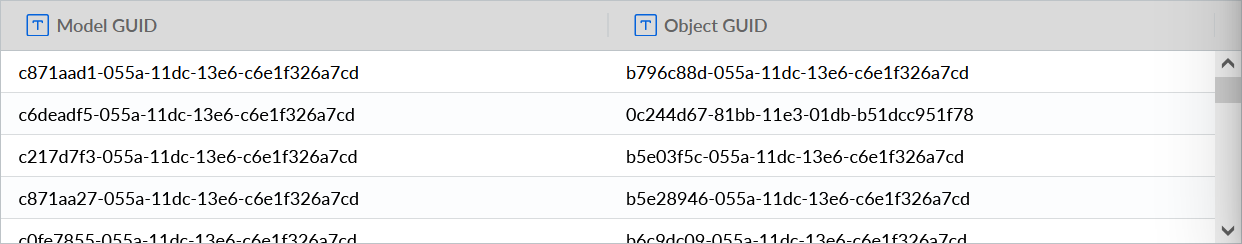
Note: All this output ultimately comes from the United Motor Group demo database.
The next things we had to do was to filter the output of the latter operator and then combine it with the output of the former.
Filtering is done with the Filter rows operator. You can see it in the overview screenshot. It’s the second operator in the Filter applications stream. Here is how it was configured:

It allows all rows to pass which contain a Model GUID that matches the value of ARIS.contextGUID. The latter is also one of the ARIS parameters mentioned above. It becomes the ID of the diagram for which the dashboard is displayed in the ARIS Connect portal. So, the result of the filtering will only contain IDs of objects which occur in the selected diagram. That’s what we wanted.
Now that we had a list of relevant objects, we needed to get the KPIs for each of them. This could be done by combining the filtered list of applications and the table with the KPIs of all applications in the database. The combination would remove all irrelevant rows from the table with the KPIs. The Combine operator we used looks like this:
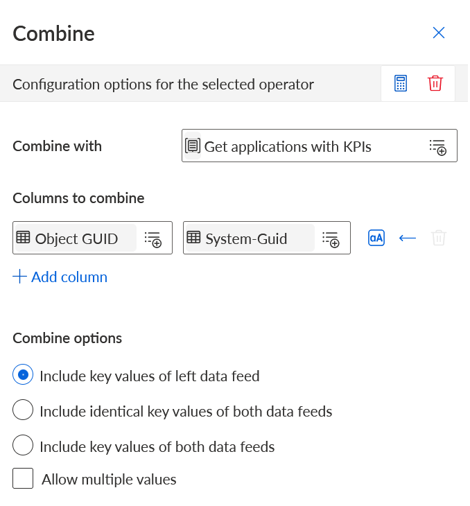
The columns used to combine the two tables are Object GUID from the diagram/application table and System-Guid from the table with the KPIs. We have chosen to include only key values of the left data feed, i.e. the filtered list, so that applications with other key values would not appear in the output.
The result looked something like this:
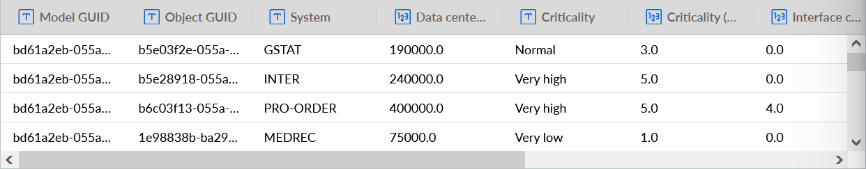
The combined table includes columns from both input tables, e.g. Model GUID from the diagram/application table and System from the KPI table. The System-Guid column from the KPI table was removed in the process. In the screenshot it does not become apparent which rows were removed, so you’ll have to trust me that it really worked as advertised.
Since we did not need the Model GUID column for the chart, it was removed with the Delete column operator which you can also see in the overview screenshot. I won’t include a screenshot for its configuration since it is trivial.
Now we come to the point where it became a bit cumbersome. As mentioned before, the risk score is only included as a numeric value in the data file and should be translated into a color code by the data feed. This is done in the stream Create color codes which is the leftmost one in the overview screenshot.
Here we started by adding a new column called Risk color. Then we used a series of Conditional replace operators to put a hex code into this column for each numeric score. The score ranges from 2 (very low risk) to 10 (very high risk), so we needed quite a bunch of these operators. The first one looks like this:
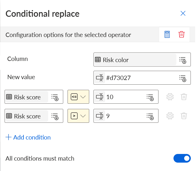
The operator in the screenshot matches values which are equal to or smaller than 10 and larger than 9. The one after it matches from 9 (included) to 8 (excluded), and so on. When a risk score matches one of the value ranges in the operators, the HTML color code specified in the New value field is written to the Risk color column. In the screenshot above this would be the code #d73027. This is a deep red as to properly alarm the person looking at the chart about the high risk of the respective application. The lower the risk score, the more the color tends to orange, yellow, and finally green.
With this series of operators in place we got the desired result. A table with applications in the selected diagram and for each application KPIs for technical fit, business value, cost, and risk (as a color). This is what it looks like:
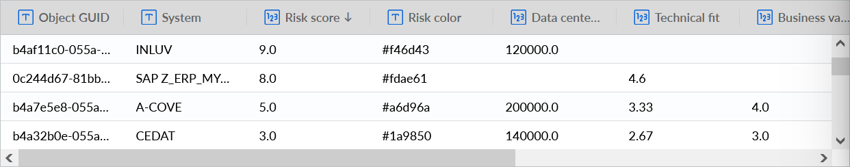
There are a few empty spots. This is due to the data not having been maintained in the repository.
Anyway, this result is the basis for the application portfolio diagram shown at the beginning of this article. With this we were ready to create the chart and the containing dashboard and this is what I’ll describe in the next article. Thanks for reading and see you there!
Monika Leitner on
It was called - if data is king - context is its crown and its so true!
I really appreciate the new way how paramters are handled in ARIS Aware. Much more easier than the old way. Beside EAM you can put content related dashboards whereever you like.
E.g
Looking forward to hear more examples