

Welcome back to the blog post series about the creation of the application portfolio dashboard in ARIS Connect! In the article before I described how the dashboard with the application portfolio diagram was made and how it was connected to the data sources we prepared before. In this article, which will be the final one in this series, I’ll describe how the dashboard will be integrated into the ARIS Connect portal. Let’s get to it!
If you are not familiar with the ARIS Connect portal, here are a few (simplified) things you need to know to understand the rest of the article. The portal is used to publish the content of ARIS databases and can be accessed with a web browser. For each diagram or object, a so-called fact sheet is provided. It usually contains information about the properties and related objects of an item.
The following screenshot is an example of an object’s fact sheet. It’s for the application A-PLAN and provides a description and information about some properties, like standardization status or warranty. It also displays related projects and responsibilities, which are connected objects:

Strictly speaking, the fact sheet is only the Overview tab of an item. But there can be additional tabs with a variety of other types of information. For us the tab Dashboards, which you can also see in the above screenshot, is interesting. It is supposed to contain a dashboard with information about the selected item.
As noted in the first article of this series, we decided to use Application System Type Diagrams as the container for the applications of an application portfolio. This would be the diagram type for which we’d add a Dashboards tab in Connect.
Trouble is that this diagram type is not only used as a container for a bunch of applications but also for describing aspects of a single application, like its modules or capabilities, which objectives it supports, which screens it uses, or which technologies it is based on. For the latter type of usage it does not make sense to offer an application portfolio dashboard.
What we did to circumvent this was to explicitly specify the diagrams for which the dashboard would be shown. Only those Application System Type Diagrams from the United Motor Group demo database came on this list which contained a set of applications and were suitable for the dashboard. This were, among others, the diagrams IT systems (domains) or IT landscape | Application portfolio (current).
In the first article of this series, I mentioned that the application portfolio dashboard is a bit elusive. This is the reason for it! You won’t find it at any Application System Type Diagram, only at those in the list. If you want to make use of the dashboard in your own database, you have to extend the whitelist of diagrams accordingly.
So much for the theory, I’ll now explain how this selective assignment was achieved.
We modified the standard configuration which is not what a customer would usually do. So I just briefly show we did and then what a customer would do to get the same results.
For dashboards which are displayed in the Dashboards tab of an item in Connect, the standard assignments are maintained in an XML file called dashboardingAsSeparateTab.xml which is located in the guts of the portal configuration on the file system of the host OS. For each diagram that should get the dashboard we added an XML stanza that looks like this:
<dashboardGroup contextItem="bd61a2eb-055a-11dc-13e6-c6e1f326a7cd">
    <content>
        <dashboard ref="bdf6a08e-d209-41d9-a3e9-a75907641bb4">
            <title language="en">EA info for ASTD 'IT systems (domains)'</title>
        </dashboard>
    </content>
</dashboardGroup>
The above is for the diagram IT systems (domains). The diagram is identified by its GUID which is specified in the contextItem attribute. The dashboard is identified by its GUID as well which is specified in the ref attribute of the dashboard element. We also specified a title which is relevant in case more than one dashboard is displayed within the Dashboards tab.
So, what does the result look like? Let’s first look at the fact sheet of the diagram (i.e. the Overview tab) because I haven’t shown the fact sheet of a diagram yet:

It shows the diagram description, a list of IT domains and a list of IT systems. These lists are based on the objects contained in the diagram. Here you can see what that looks like:
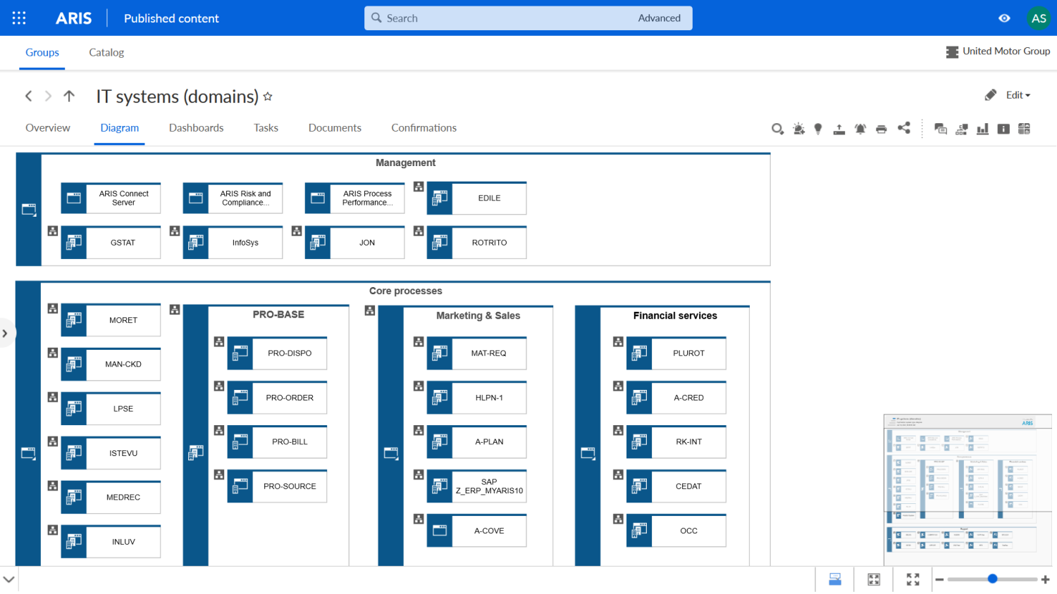
In the diagram you can also find the domains and the applications encompassed by them, just like in the fact sheet.
Now, let’s finally look at the dashboard within the diagram context. That’s obviously what we were working towards the whole time. If we set up everything correctly, it should show us information about these applications. And here it is:

Isn’t that cool? At least for me it was pretty exciting when I first saw it like this. And indeed, the information in it seems to be confined to applications occurring in the diagram. You can see some application names in the Replacement candidates chart on the right for verification.
You can also check the application names in the application portfolio chart we spent so much time upon by hovering with the mouse pointer over the bubbles:

In the tool tip that opens upon hovering, you can also see the exact values for the business value, the technical fit and the costs of the application. Neat!
So much for the standard implementation. If you want to assign dashboards to your diagrams in your database, you should take a different route, though. One where the assignment will not get overwritten the next time you upgrade the ARIS installation. This is how you do it…
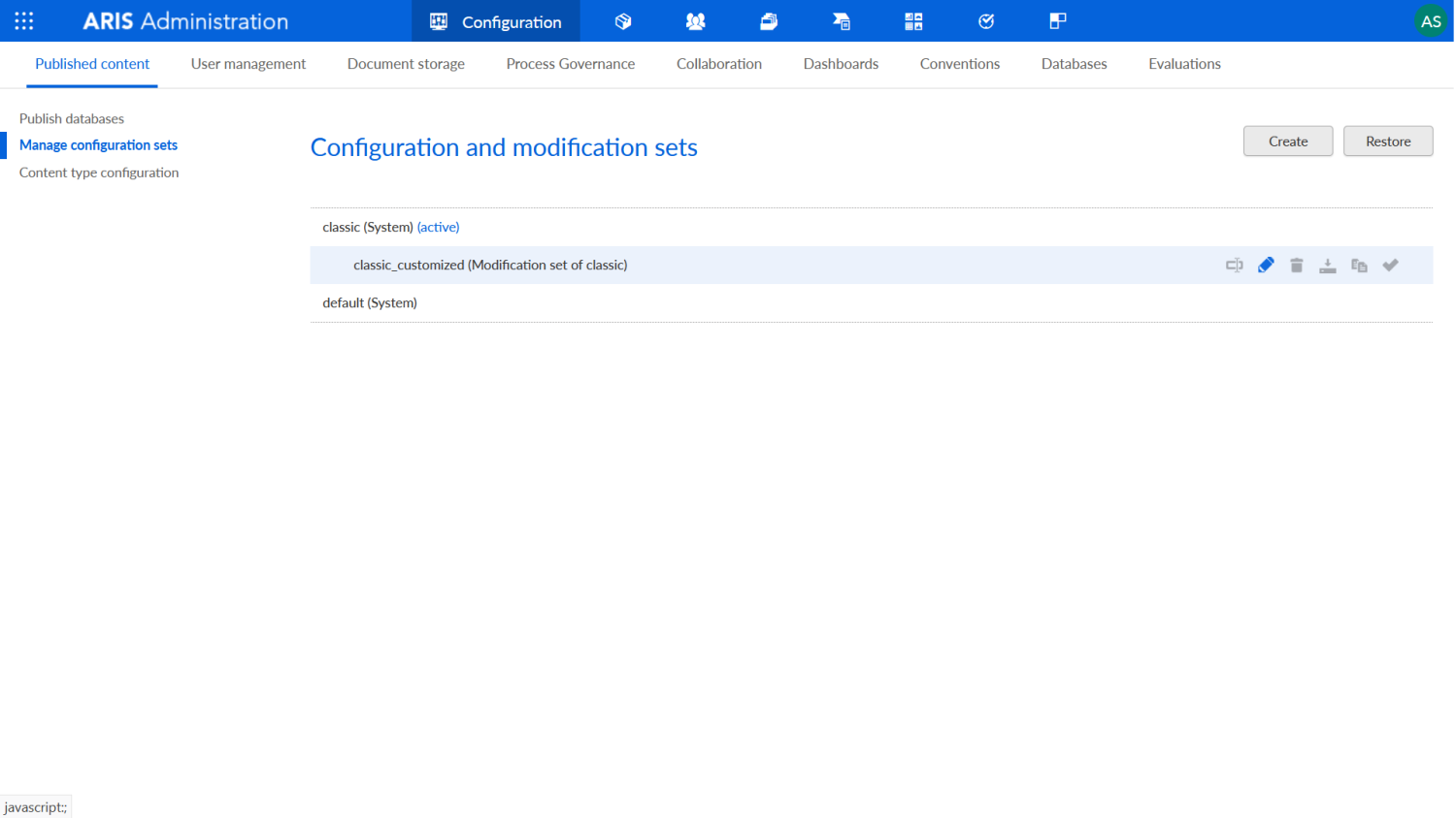
Open the Connect administration, navigate to Configuration > Published content > Manage configuration sets and create a modification set for the config set of your choice. In the screenshot below I created a modification set for the config set classic and named it classic_customized:
Click on its pencil icon to edit it, open the Components tab and click on the edit icon of the Dashboards component. This will bring you to the following view where you can see the currently assigned dashboards. And here waits a small surprise. If you scroll a bit downward, you’ll see the standard assignments of our application portfolio dashboard:

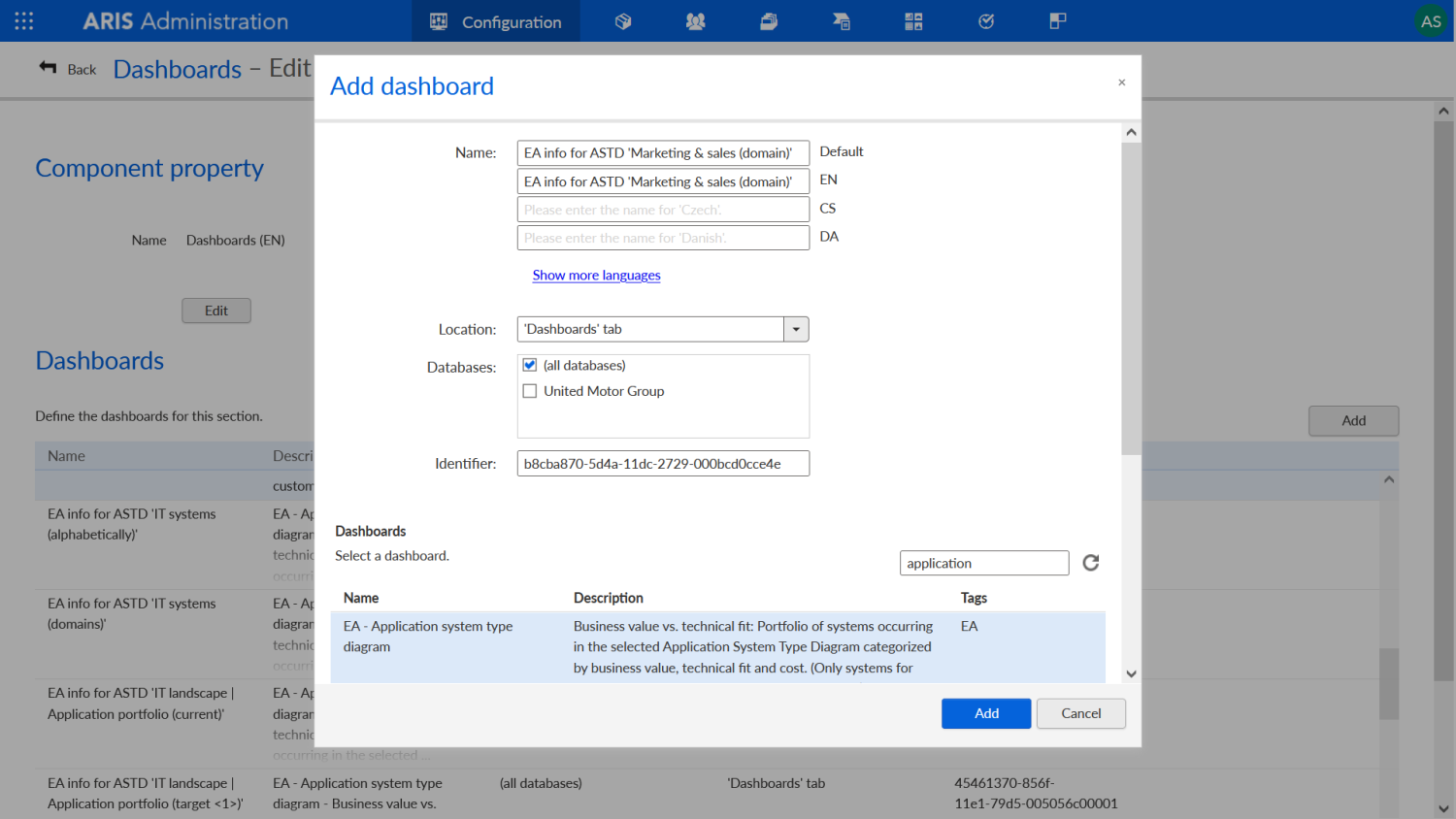
If you don’t like the available assignments, you could delete or change them here. But our goal now is to define a new one. For that, click on Add. This will open a dialog where you can make the same settings you saw before in the XML file: name, location, and dashboard. As an example, I picked another diagram from the UMG database called Marketing & sales (domain) and got its GUID which is b8cba870-5d4a-11dc-2729-000bcd0cce4e. This is what the dialog looks like with all the necessary settings made:
Once you have done this and click on Add, the assignment is ready. After you’ve activated the new modification set, navigate to the diagram in Connect and you should see a Dashboards tab with our application portfolio dashboard. Note that the data for it is already available because we generated it for all applications in the database.
This brings us to the end of the blog post series. Thanks a lot for reading! Perhaps this story about the development of an actual standard dashboard in ARIS showed you that this is indeed a fun undertaking and inspired you to try it out yourself. I’d be glad if it did. See you around!